
This post was written for Dowmap, the app & web development company. View the original post on Medium here.
Most of us remember a time before flat design, when user interfaces did not consist of minimalist icons and bright colours, but objects designed to look very much like their physical counterparts. This mimicry was a design trend known as skeuomorphism.
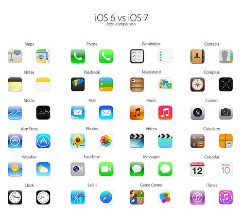
Skeuomorphism began in the 1980’s but it became trendy thanks to Scott Forstall at Apple when iOS’s UI design used skeuomorphism across the board. You need only recall the designs for iOS 6 and before, where icons were mostly ornamental. and used textures, lights and colours to create depth and realism.
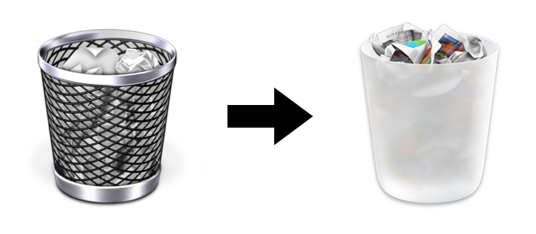
The most easily recognizable example of skeuomorphism is perhaps the trash can icon. This icon was designed to look like an actual trash can, invoking a sense of familiarity and making it easy to discern what it’s functionality would be. You might also recall other examples of skeuomorphism from before, such as the newsstand icon for iOS.
Looking back, we might wonder why we ever found skeuomorphic designs so palatable. Didn’t it make interfaces look cluttered, and weren’t the useless details unnecessary? It is easy to forget that skeuomorphism served a very important purpose and it is something we cannot easily push to the wayside, even if we may not be using it in designing most of our interfaces today.
It is important to remember that when skeuomorphism was first used in design, computers and smart phones were not as commonly used. The navigation of interfaces weren’t as familiar or second-nature as they are to us today. By using skeuomorphism in designing interfaces, developers made it easier for users to understand what a device, application or button could do. The logic behind skeuomorphism comes from the Theory of Affordances. In the 1970’s psychologist James J. Gibson put forward the idea that humans perceive their environment based on “affordances” or objects that offered clues of what their functions were. By applying this idea using skeuomorphism, UI designers helped an entire generation of users familiarize themselves with digital interfaces.
By 2007 though, these interfaces had served their purpose. Skeuomorphism had outlived its function and Forbes magazine declared the design trend dead. This was mainly thanks to Apple’s new lead iOS developer Jonny Ive who made iOS 7 usher in the new trend– flat design. Windows 8 soon followed.
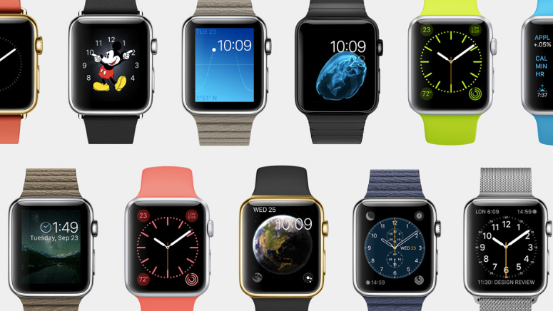
Flat design is still prevalent today, while skeuomorphism appears to be completely out of the picture. But some argue that this is not true. The revival of skeuomorphism is believed to be occurring in the world of smart watch design. Smart watch interfaces are being made to look like analogue watches in a bid to make them more popular.
Others point out that skeuomorphism is making a comeback in virtual reality(VR) and augmented reality(AR). As technology makes strides in the field of VR and AR, they believe that skeuomorphism will once again have to be used to “train” users to understand the concepts in use.
But are we really bringing back skeuomorphism if it never really went away? Kelsey Campbell-Dollaghan at Gizmodo puts across an interesting point: “We’d argue that skeuomorphism and flat design aren’t as far apart as they appear. A camera icon, for example, still appears on the camera functionality in iOS 7. It may be a slightly less realistic camera icon than would have been used in the past but flat design doesn’t so much replace skeuomorphism as mute it.”
At this point, we cannot predict if skeuomorphism will ever be as big as it was over a decade ago, but what we can agree on is that skeuomorphism is to thank for the great UI design trends that have come after it.